ALIF
Brand identity · Web · Interaction
Year
'26
Role
Brand Identity, Visual Design, Web Design
Tools
Framer, Photoshop, Illustrator, Relume
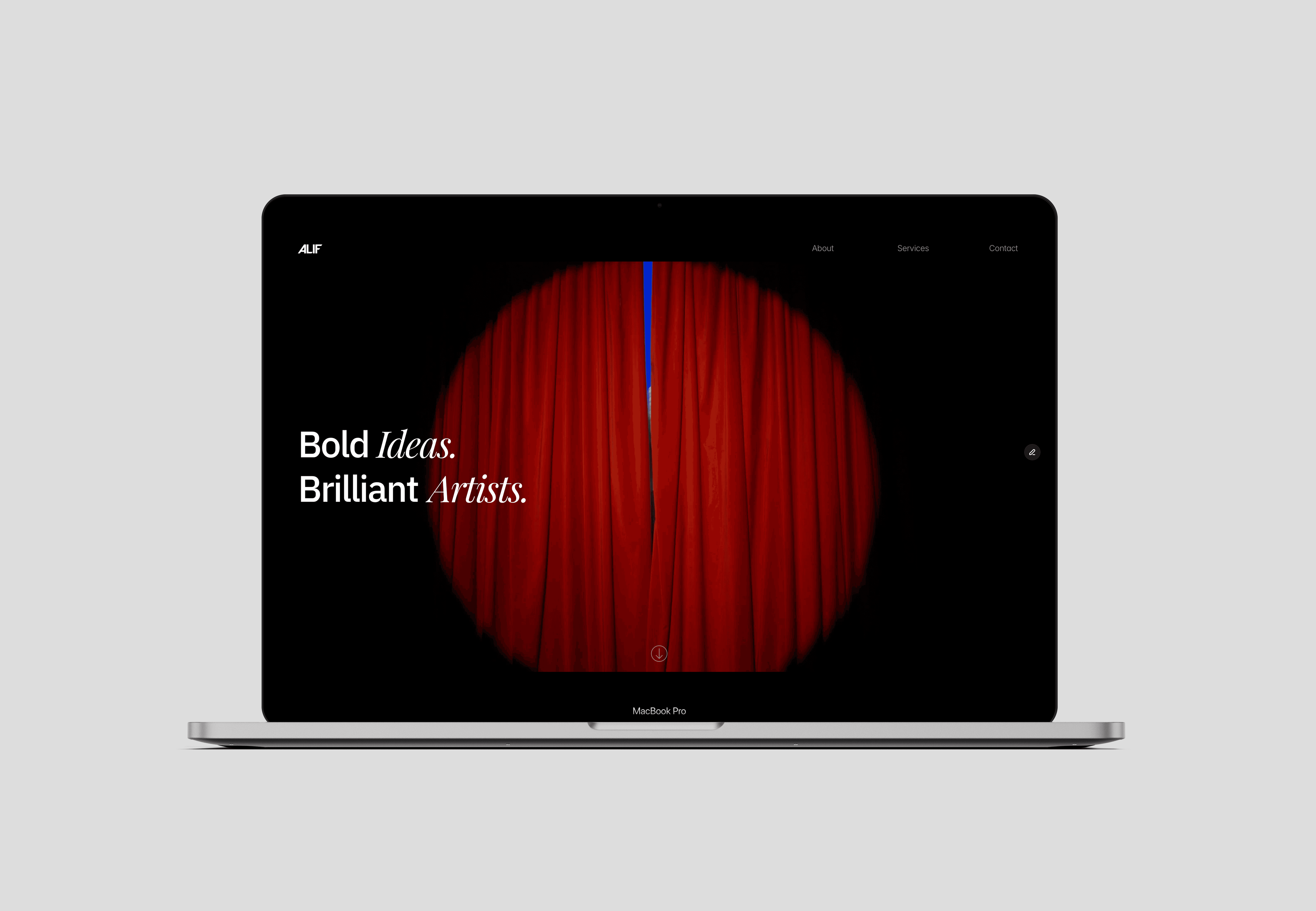
ALIF’s existing identity and site left visitors unclear on what the company actually did. The project involved a full research-driven redesign — brand identity, information architecture, and a new Framer-built website — rebuilt around what artists actually needed to know.
Challenge
ALIF’s existing site didn’t answer the questions artists had when considering a producing company — what they do, what the process looks like, whether the fit is right. The identity relied on decorative typography that communicated personality but not services.
The challenge was to rebuild both the brand and the site around clarity: a system that could communicate ALIF’s positioning immediately, build trust with the right artists, and make the path from landing to contact as simple as possible.
Previous identity & website (before redesign)
The earlier identity relied on decorative typography and fragmented layouts, limiting clarity, scalability, and digital usability.
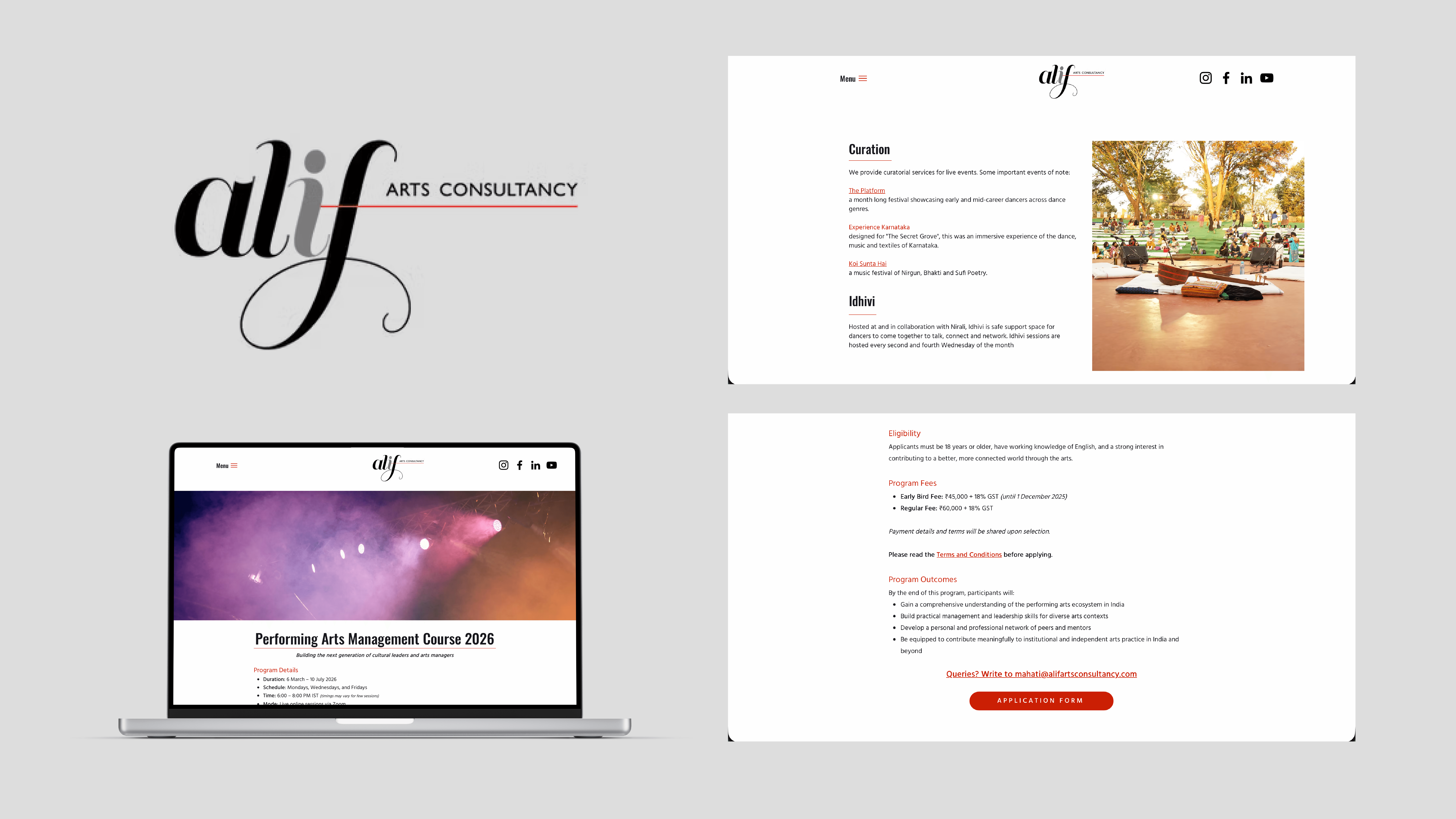
Selected screens from the original ALIF identity and website prior to redesign.
Approach
The project was executed in two phases:
Redesigning the brand identity as a cohesive, digital-first system
Translating the identity into a structured, intuitive website experience

Research & Strategy
Before designing the site, a short questionnaire was shared with artists to understand what they needed to know before trusting a producing company. The findings — ranked across six information needs — directly shaped the site’s structure and content hierarchy.
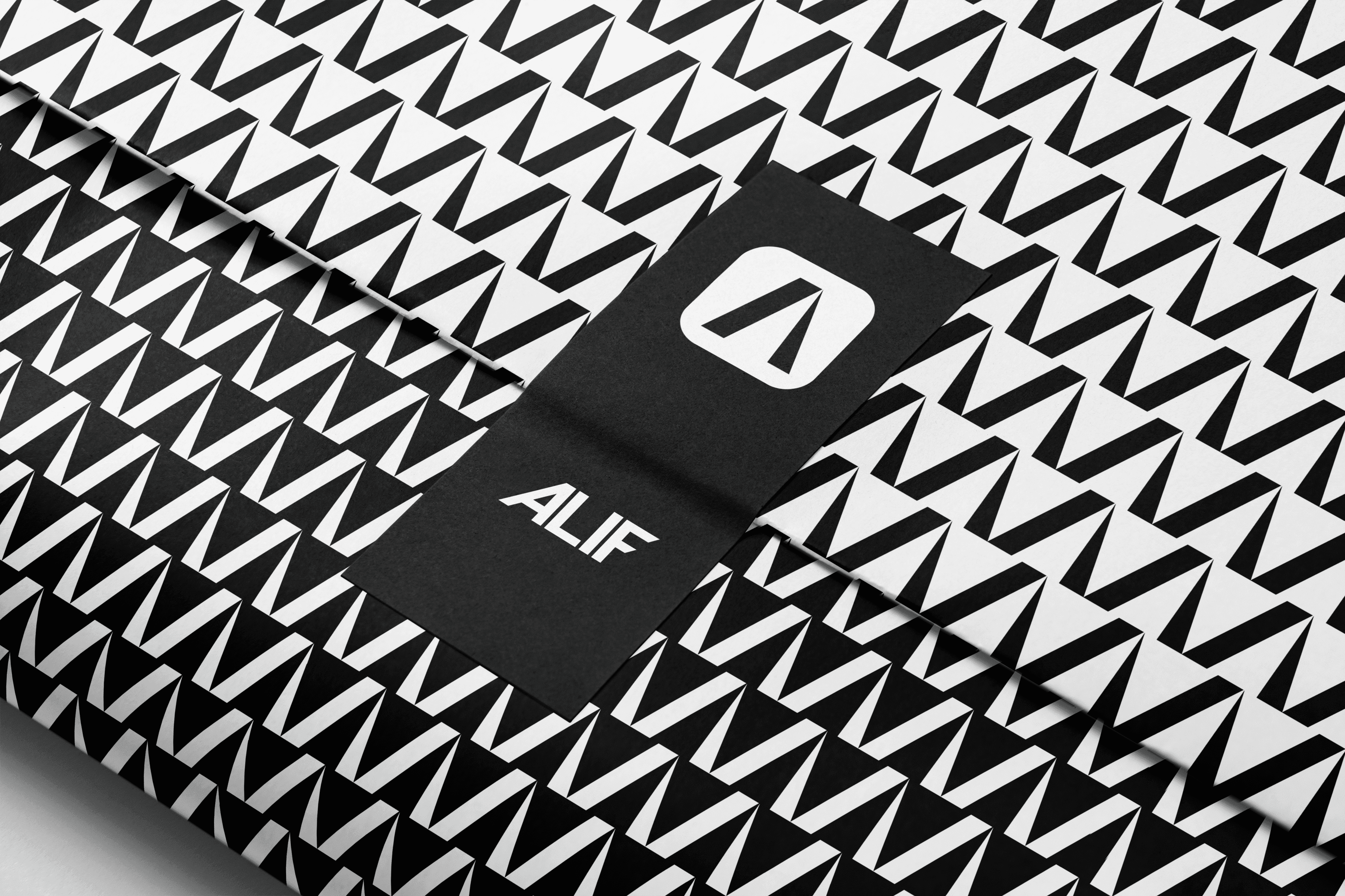
ALIF is built to foreground artists and their work. The identity needed to communicate confidence and cultural relevance without becoming decorative or corporate — balancing bold expression with structural discipline.
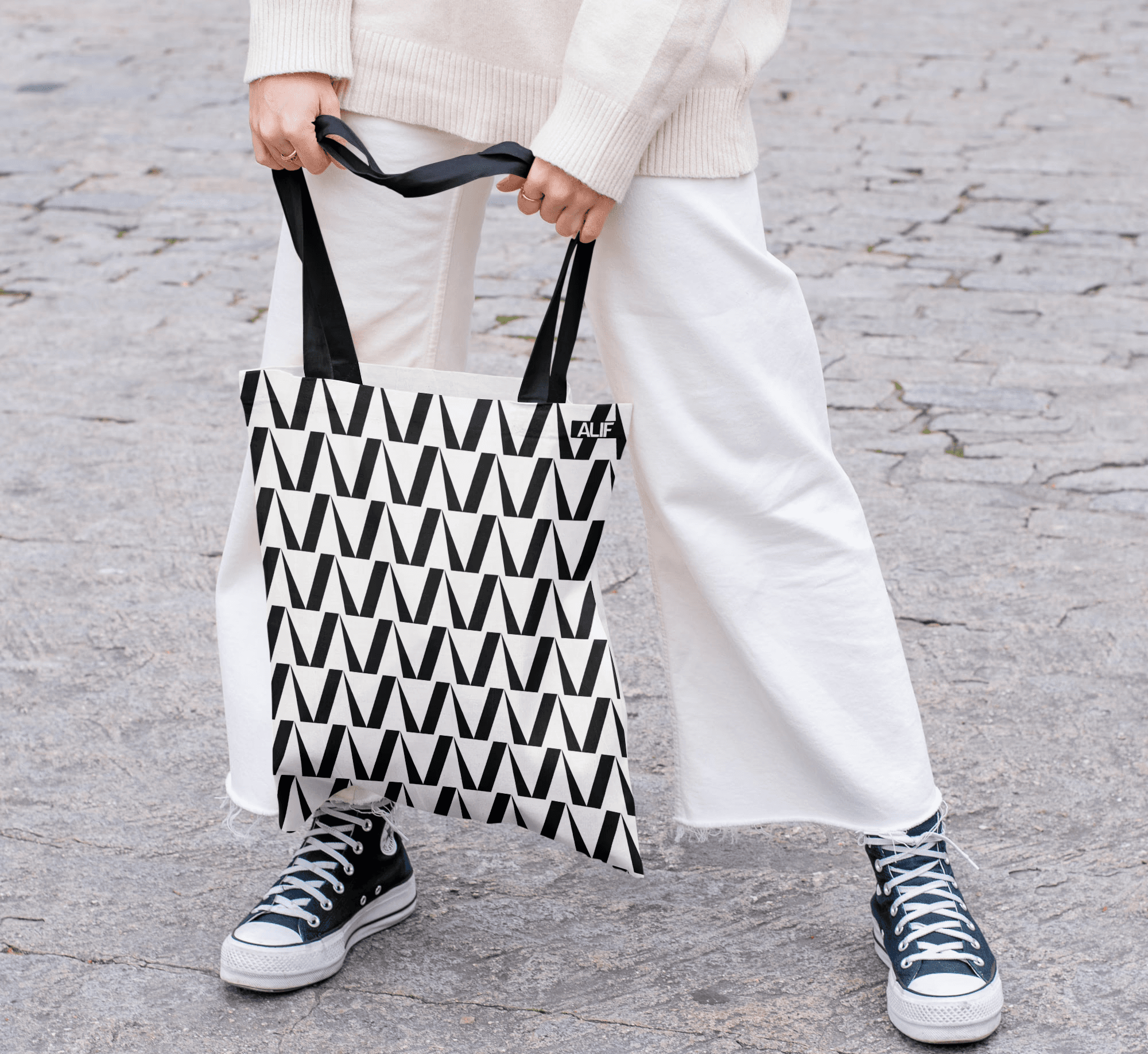
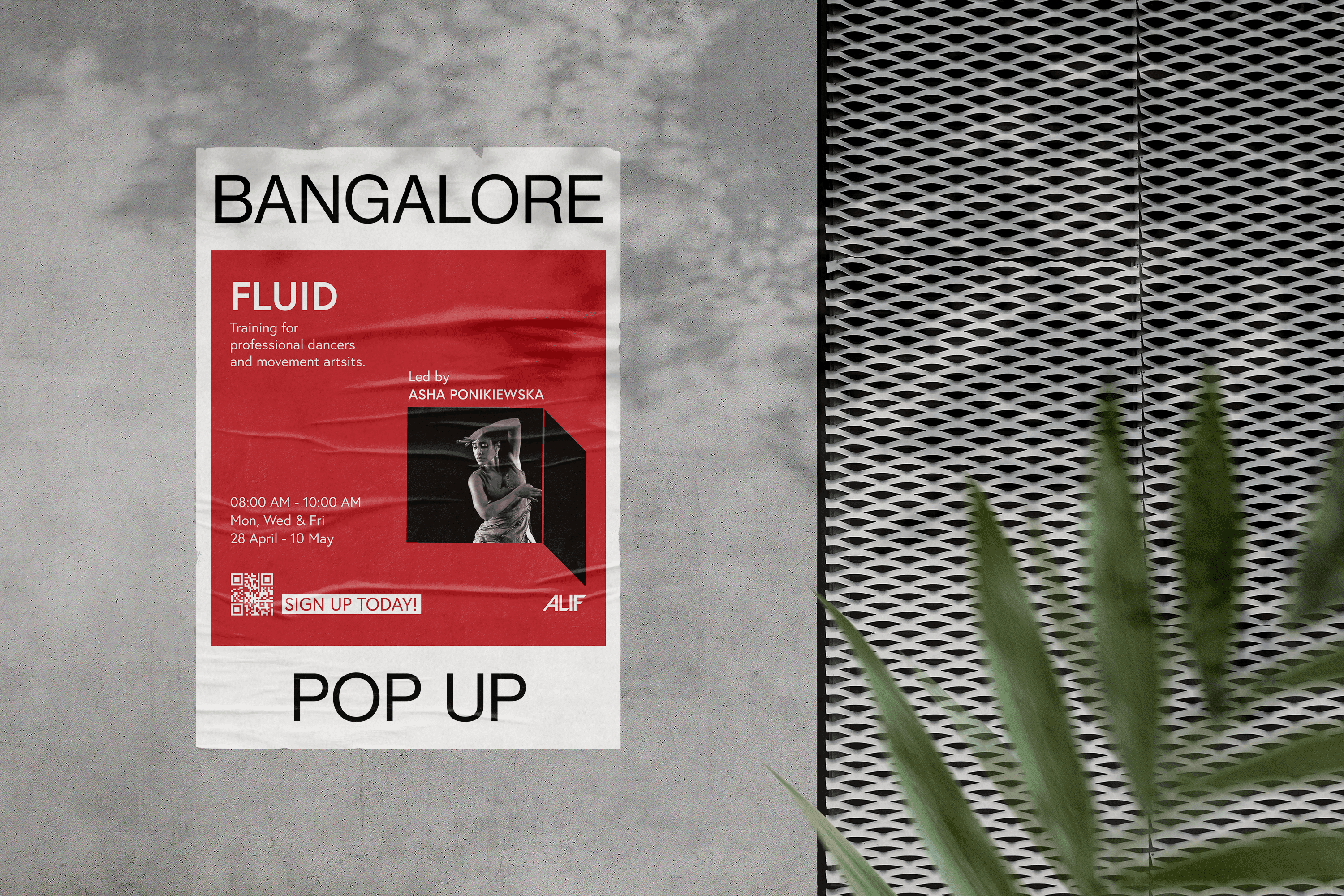
The resulting system is editorial in tone, flexible across disciplines, and declarative at first glance, while remaining restrained in application.
The wordmark was developed through an exploration of form and reduction. A forward-leaning A introduces a sense of motion and progression, while the parallel cut in the F establishes rhythm and consistency across the system.

From Identity to Website
The findings from the research phase — ranked across six information needs — directly shaped the site’s structure. Services and process were made the primary content on every page. The Artists section was built to establish trust through peer examples. Contact was kept one step away at all times.

Early sitemap mapping page structure and navigation before visual design.
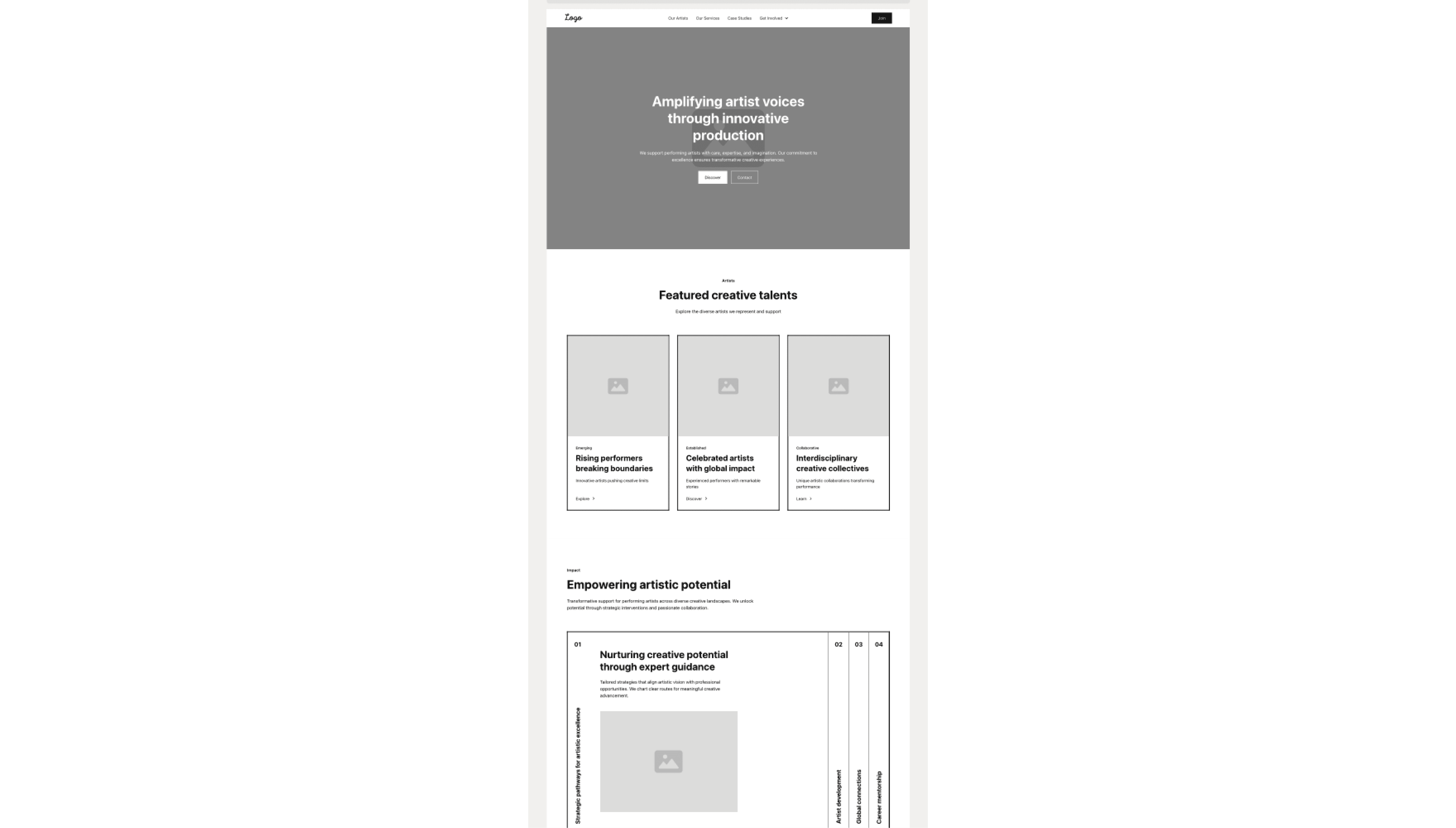
Early homepage wireframe used to establish content hierarchy and section flow prior to high-fidelity design.

Information architecture and early homepage structure were mapped to define user pathways before moving into high-fidelity design.
The website was designed and built directly in Framer, allowing visual identity, layout, and interaction to be developed as a unified system. The design emphasizes typographic rhythm, contrast, and subtle motion to support the brand without distraction.
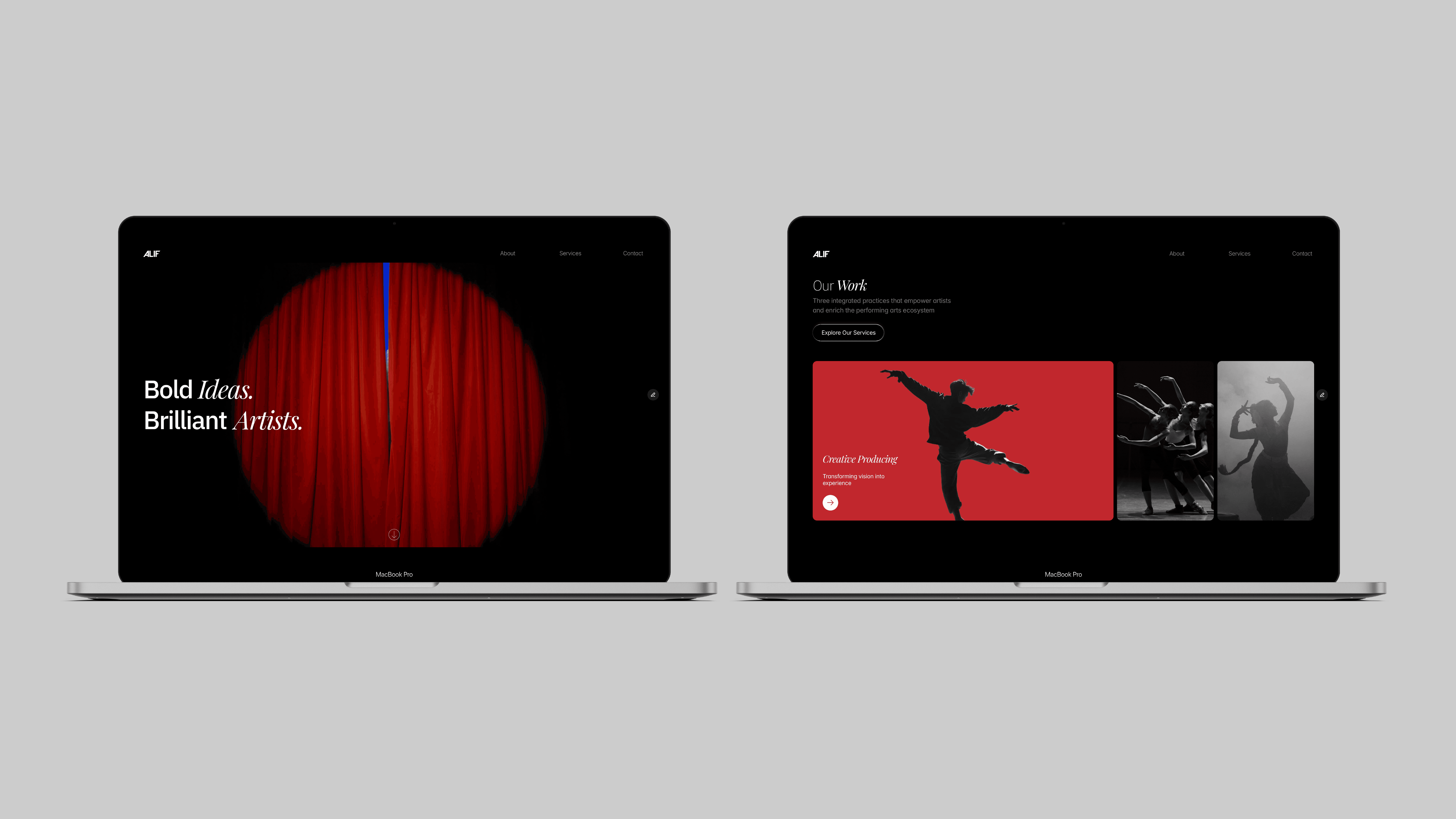
Homepage layouts demonstrating the system across key sections.

Outcome
The redesign replaced a decorative, ambiguous identity with a system built around clarity — a reduced four-page structure that answers what artists need to know, in the order they need to know it.
The project was delivered end-to-end: research, brand identity, information architecture, UI design, and Framer build — a complete system ready to scale as ALIF’s roster grows.
Challenge
ALIF’s existing site didn’t answer the questions artists had when considering a producing company — what they do, what the process looks like, whether the fit is right. The identity relied on decorative typography that communicated personality but not services.
The challenge was to rebuild both the brand and the site around clarity: a system that could communicate ALIF’s positioning immediately, build trust with the right artists, and make the path from landing to contact as simple as possible.
Previous identity & website (before redesign)
The earlier identity relied on decorative typography and fragmented layouts, limiting clarity, scalability, and digital usability.
Selected screens from the original ALIF identity and website prior to redesign.
Approach
The project was executed in two phases:
Redesigning the brand identity as a cohesive, digital-first system
Translating the identity into a structured, intuitive website experience
Research & Strategy
Before designing the site, a short questionnaire was shared with artists to understand what they needed to know before trusting a producing company. The findings — ranked across six information needs — directly shaped the site’s structure and content hierarchy.
ALIF is built to foreground artists and their work. The identity needed to communicate confidence and cultural relevance without becoming decorative or corporate — balancing bold expression with structural discipline.
The resulting system is editorial in tone, flexible across disciplines, and declarative at first glance, while remaining restrained in application.
The wordmark was developed through an exploration of form and reduction. A forward-leaning A introduces a sense of motion and progression, while the parallel cut in the F establishes rhythm and consistency across the system.
From Identity to Website
The findings from the research phase — ranked across six information needs — directly shaped the site’s structure. Services and process were made the primary content on every page. The Artists section was built to establish trust through peer examples. Contact was kept one step away at all times.
Early sitemap mapping page structure and navigation before visual design.
Early homepage wireframe used to establish content hierarchy and section flow prior to high-fidelity design.
Information architecture and early homepage structure were mapped to define user pathways before moving into high-fidelity design.
The website was designed and built directly in Framer, allowing visual identity, layout, and interaction to be developed as a unified system. The design emphasizes typographic rhythm, contrast, and subtle motion to support the brand without distraction.
Homepage layouts demonstrating the system across key sections.
Outcome
The redesign replaced a decorative, ambiguous identity with a system built around clarity — a reduced four-page structure that answers what artists need to know, in the order they need to know it.
The project was delivered end-to-end: research, brand identity, information architecture, UI design, and Framer build — a complete system ready to scale as ALIF’s roster grows.
2025
Ryse Therapy
Coca-Cola Creations: Halloween